Hello, I’m Chris Surridge, director of Whitefish Marketing, and today we have another one of our Whitefish Wednesday videos. So today we’ll be talking about the building blocks of what I consider to be the perfect, or the ideal landing page. We’ve heard about landing pages before or you should have heard about landing pages before, I’m sure. Where we know how important it is if you’re sending PPC traffic to a landing page, or if you’ve got a social marketing campaign pointing towards a landing page. You want that landing page to work, especially if you’re expelling money to get people to drive traffic to that landing page.
Makeup of a Landing Page
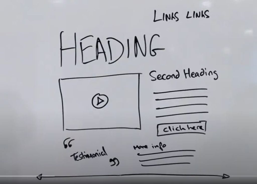
So we’re going to talk about the makeup of a landing page and what goes into the perfect landing page. So, first and foremost, headings. We’ve got to have a striking heading, a real purposeful header one tag there, which is your main heading, simple as that. From there we also have a secondary heading. Don’t forget or miss them. Do not miss that opportunity of having a secondary heading. So header two tags and then later on down the line, you could have header three tags and so on and so forth. Again that also helps with your SEO authorization as well. So what else have we got here? We’ve got the main heading, we’ve got the the secondary heading, your core body of content, whether it’s on the more information or on the second handing. However it is, have a look at the grammar. The worst thing of all is if you’ve got spelling mistakes in there, or if you have grammar mistakes. So do just go ahead and check up, scan your eyes over your content and proofread everything.
Utilising an Image on your Landing Page
After that, let’s have a look at the image here. So whether that be a video, whether that be an image, a rotating banner, whatever it happens to be, some sort of striking image to actually channel people’s eyes and their attention to what this piece is all about, what your landing page is all about. Try not to have cliche images. If you’re an accountancy firm, a tree sprouting from hands or typing on a keyboard or something of this nature, all of these kind of cliche pictures. That’s great, but, realistically, it doesn’t actually tell people what the purpose of the page is about. So wherever possible, try to use our own brand identity. Subsequently having some sort of rich media piece there, whether it be a picture or a video.
Call To Action
Then we also want to have a look at your call to action. There’s no point in having a landing page without a strong call to action. In this case here, click here. If we had some colored pens, maybe we would have that in a different color in some sort of contrast in color to what your norm is and subsequently making it stand out. So you’ve got a voice there, click here is one aspect, having it as a button and having it as a different color, that’s another personal thing that you need to consider. So do consider both those aspects.
Testimonials and Social Proof
We’ll also have a look at testimonials, social proof, some sort of trust factor there that people can recognize. Testimonials is a great way, and I believe that we’ve got some statistics here that talk about conversion rates. I think testimonials and Google reviews on sales pages help conversion rates increase by about 18%, something along those lines. So these are great things to have on your website. Another thing, links. Don’t have too many links on your website, on your landing page space. You’re driving people to this particular page to read this particular information. You don’t necessarily want them to be linking off and going off to other third party aspects. Even if it is on your own website, you want them to engage on this page.
Continue to Optimize Your Landing Page
Now, try and keep things above the fold. Before people start scrolling down having a look at what’s left for the rest of the site, try and keep all the pertinent information and all the actual points above the fold. When someone actually lands on the page itself. And the last thing there, is have a look at your split A/B testing. Always try to revise and optimize your landing pages wherever possible. So you might want to go ahead and change the words from, click here to, ask now or to inquire today, whatever it might be, you might want to move the click here button. You might want to try a static image instead of video or rotating banners. You might want to change your heading and so on and so forth. So all these kind of things you might want to go ahead and test on your site. So continually test with split A/B testing or ABC multivariate testing, whatever it might be. And in essence, that there is the makeup of a good landing page. It’s as simple as that, it’s a short, sweet, quick and simple video.
If you want to have any more videos, please have a look at our YouTube channel or failing that, come have a look at the Whitefish Marketing blog, and we’ll see you again for another of Whitefish Wednesday video. Thank you.